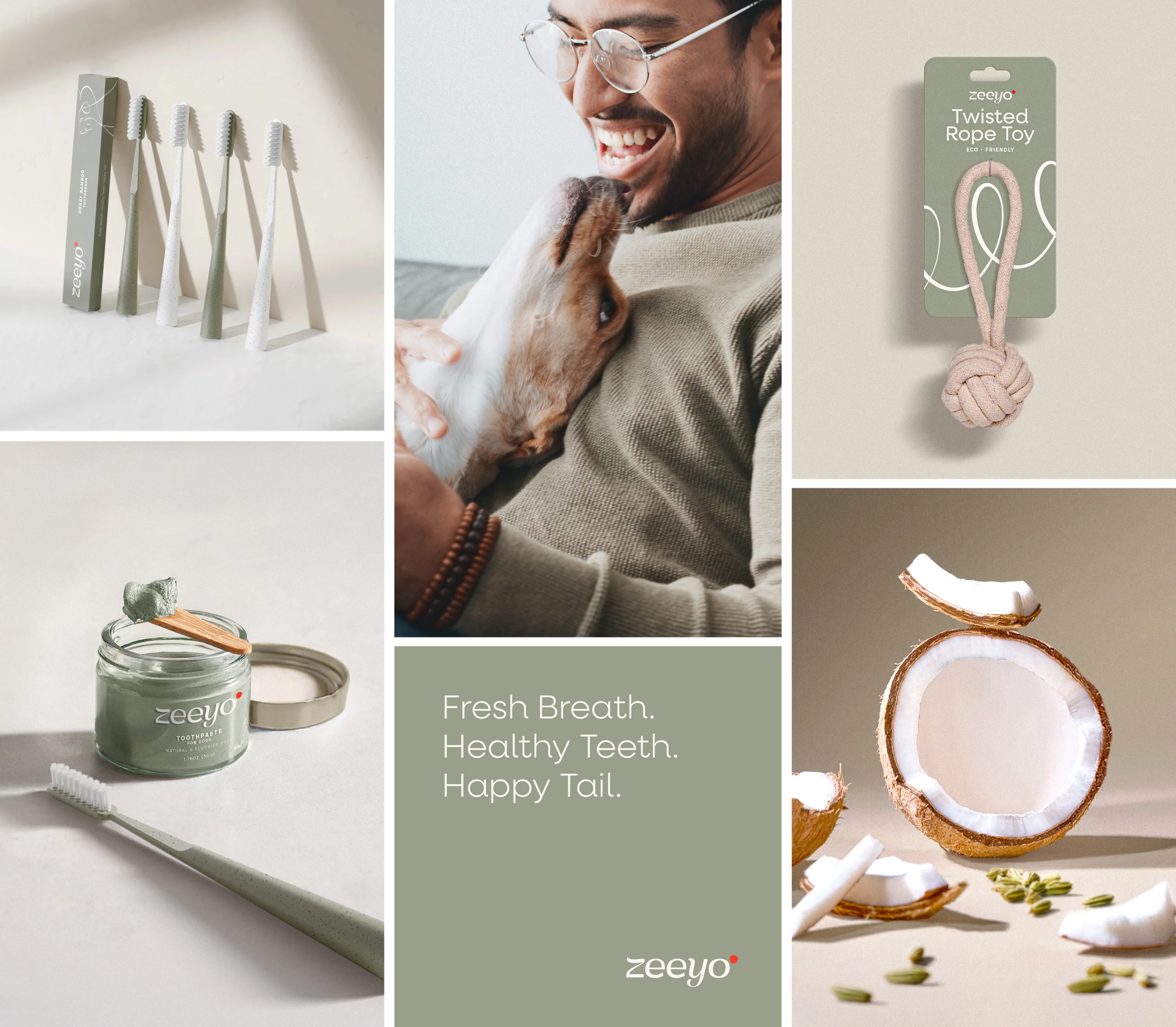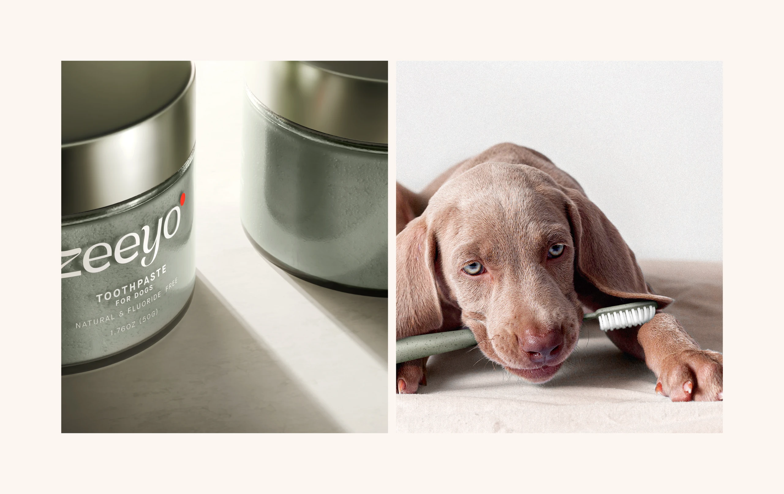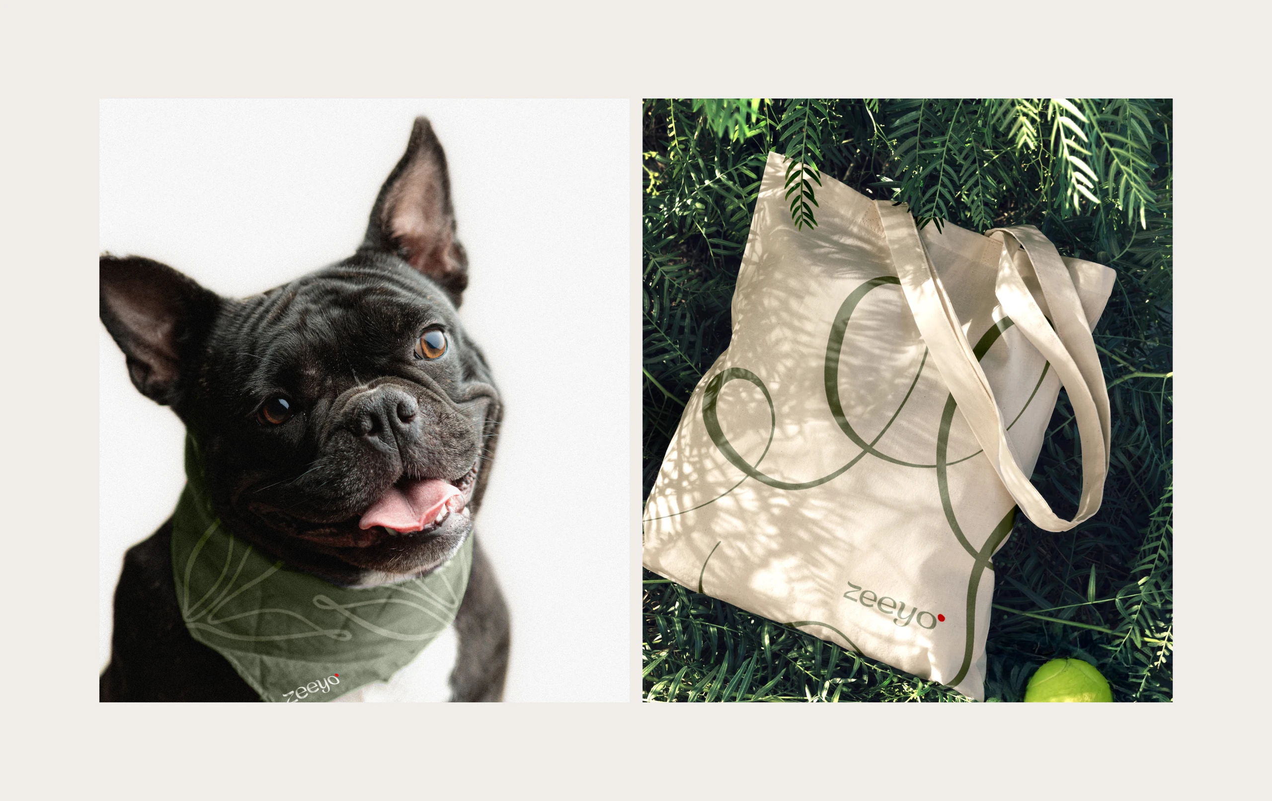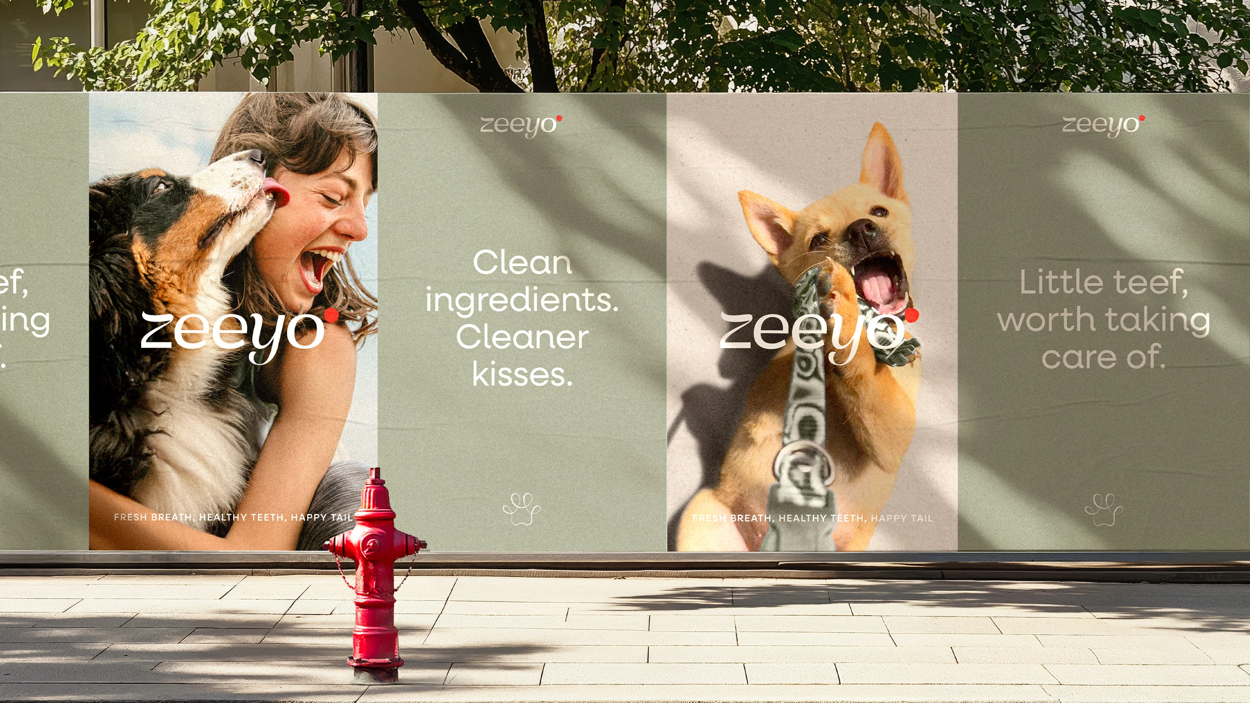
A Tail of Healthier “Teef”
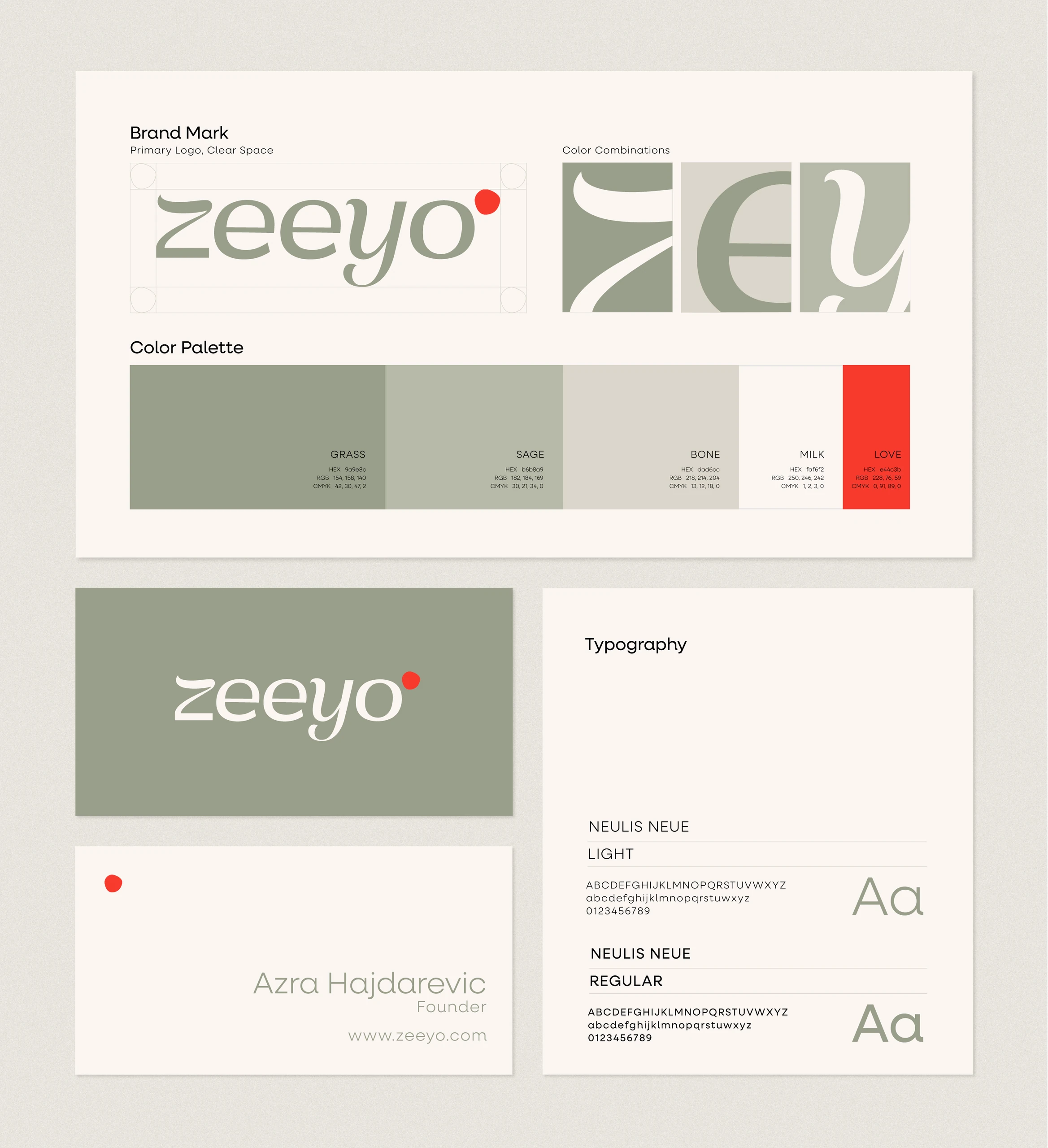
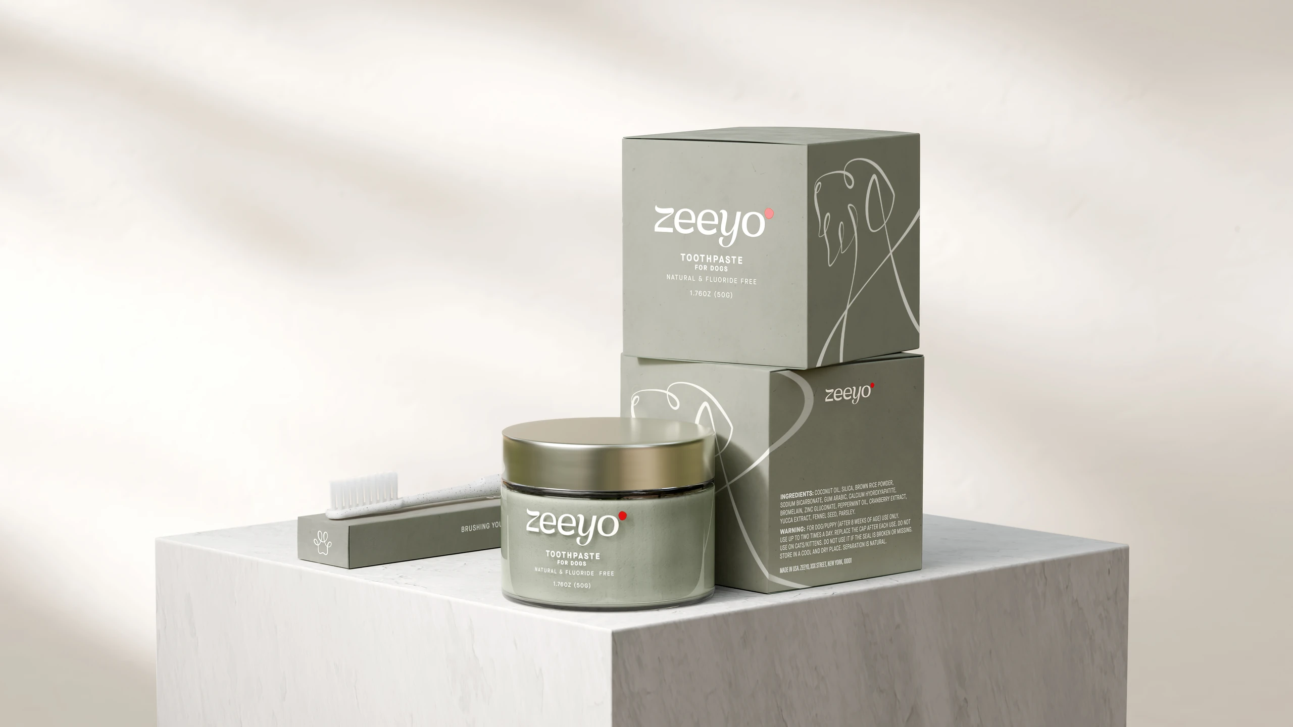
We built a brand identity that stands apart from the cold, mass, prescription-style designs dominating the category. Bold yet approachable, the logo balances thick and thin strokes to convey established clinical credibility, while clean, sans-serif forms modernize and soften the mark. Single-line illustrations add movement, energy, and life — the trails ahead filled with longer, healthier years together.
Execution:
- Brand Strategy
- Visual Identity
- Brand Activation
- Packaging Design
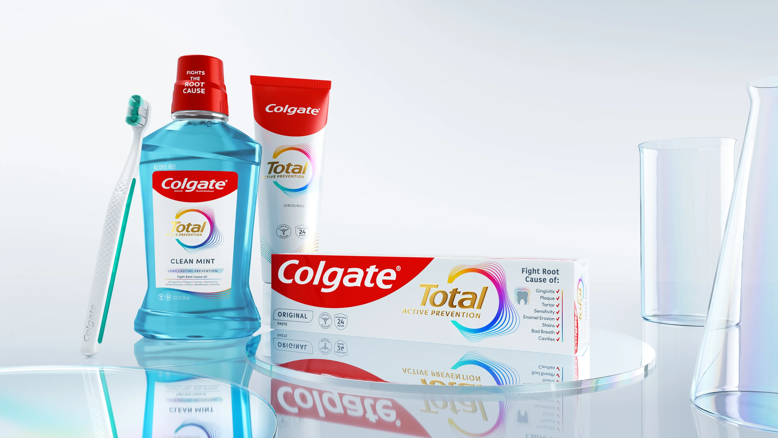
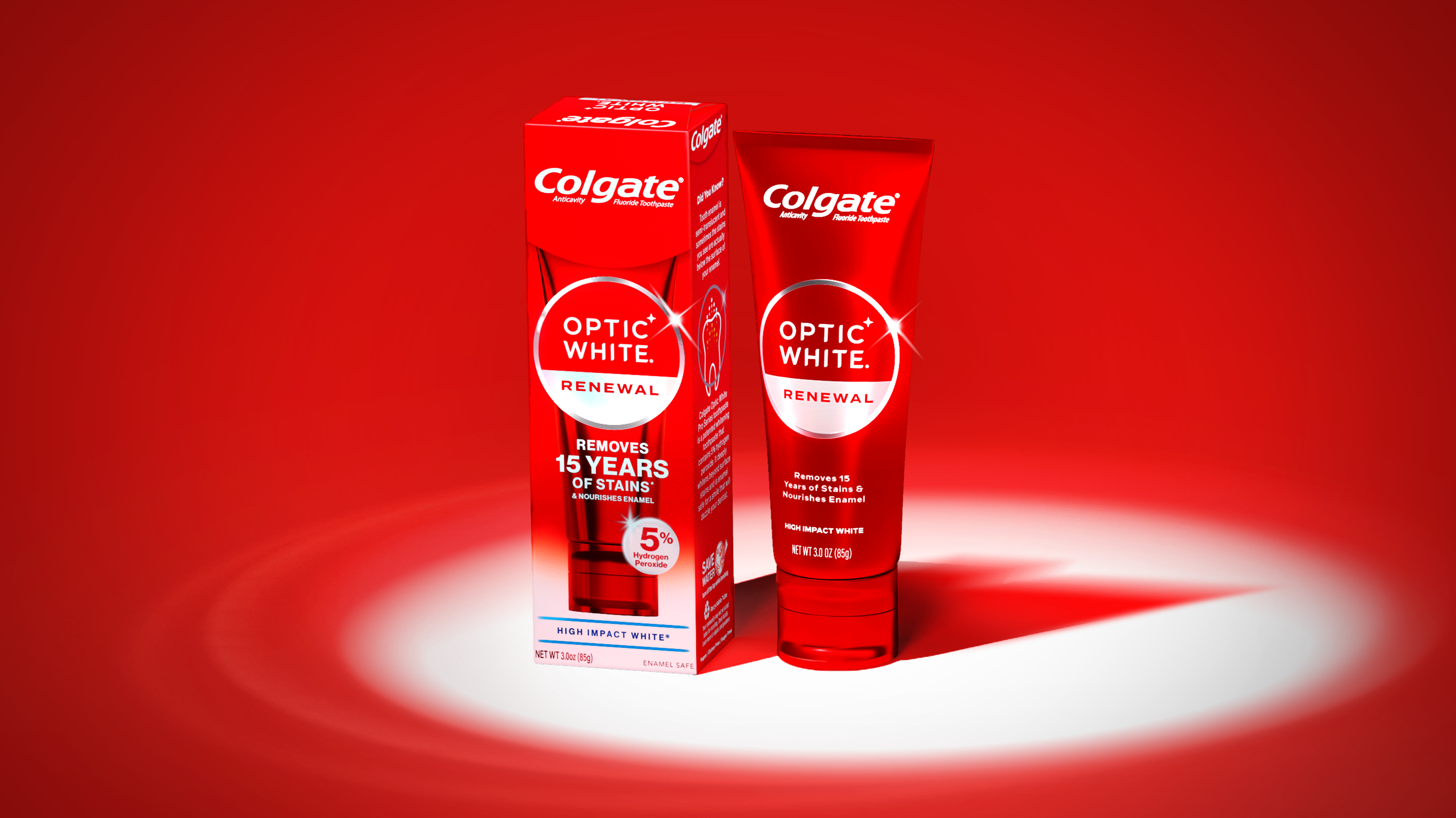
- Product Rendering